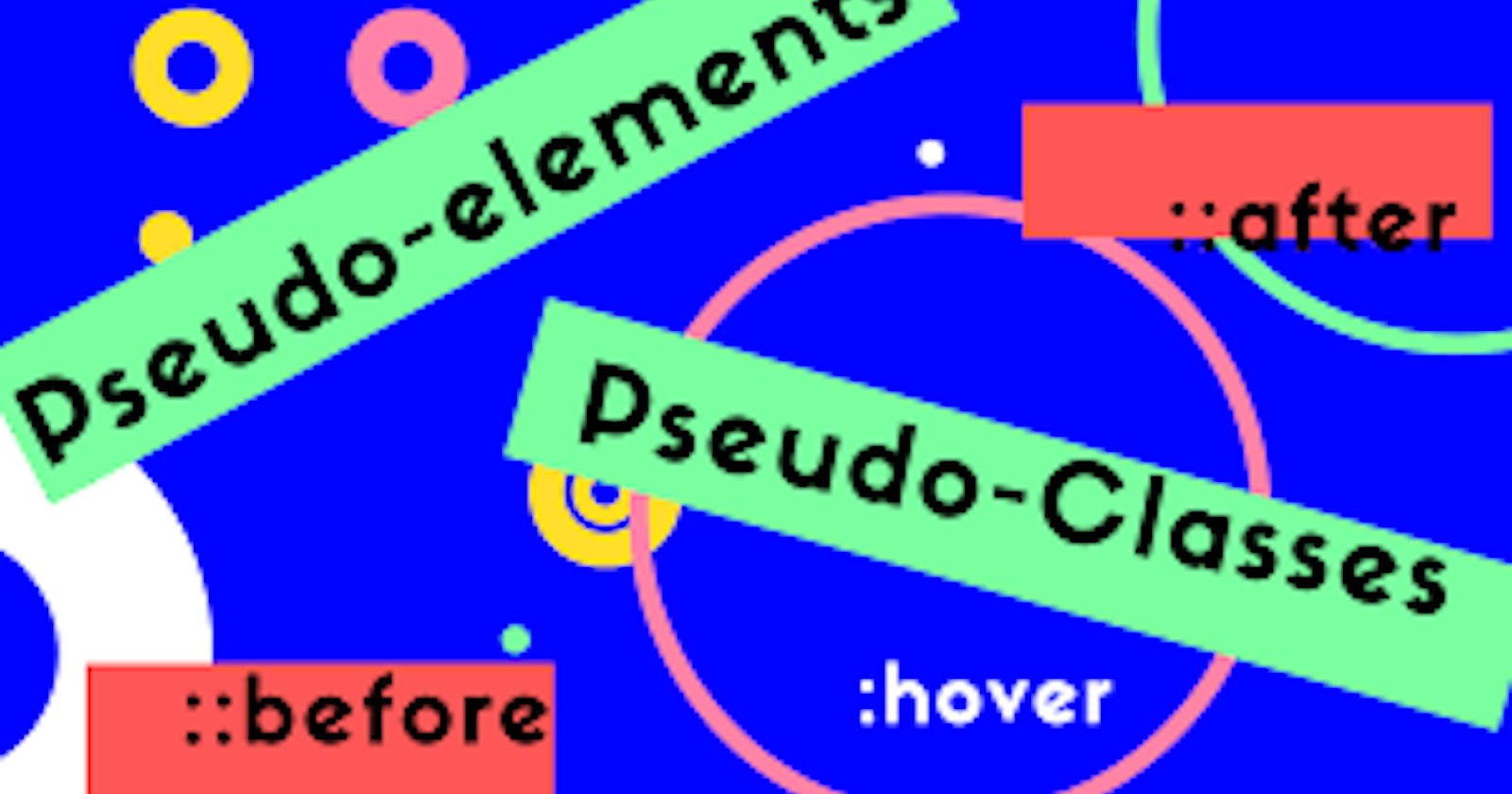
How to use Pseudo-elements, and Pseudo-classes.
CSS functions and properties you should use in 2022


I was lying on the couch and I got the inspiration to write about this awesome topic in CSS because I believe that they are some properties and functions that need some simplistic approach to explain.
Moreover, I think there is a high chance that you probably haven't used some of the CSS functions I will be explaining here. I will also show you how to use them.
Prerequisite
- I'm assuming that you are already familiar with HTML.
- Not to worry though, this article is very much beginner-friendly and also great for advanced CSS developers.
Grab a coffee, take a deep breath and enjoy the read.
What I will be discussing include
- Pseudo-elements
- Pseudo-classes
Pseudo Elements
What are Pseudo Elements?
Pseudo-elements are CSS keywords that gives you the access to target HTML elements in other to avoid writing extra pieces of HTML codes.
Some popular and used Pseudo-elements include
- ::before and ::after
- ::first-letter
- ::first-line
- ::marker
- ::selection
- ::placeholder
- ::backdrop
::before and ::after
These pseudo-elements are used for adding child elements inside an element. You can specify image URLs, stings, etc by making use of the content property when you define your CSS styling.
::before is specifically used for adding child elements before the element.
::after is used for adding a child element after the element you wish to add.
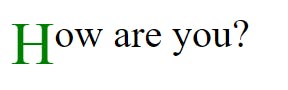
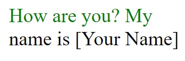
HTML
<p>How are you?,</p>
CSS
   p::before {
        content: "Hi Peter!";
        font-size: 18px;
        color: blue;
        padding-right: 5px;
      }
   p::after {
        content: "Fine";
        font-weight: 700;
        font-size: 18px;
        color: gray;
        padding: 5px;
      }
Output
![peter].PNG](https://cdn.hashnode.com/res/hashnode/image/upload/v1655408492648/Uq6phJwZ3.PNG?auto=compress,format&format=webp)
::first-letter
This will target the first letter in a text.
Example
CSS
 p::first-letter {
        font-size: 24px;
        color: green;
        float: left;
      }
Output
::first-line
This is used to style the first line of text provided that the element has the display property set to block, inline-block, inline-item, and table-cell
CSS
  p::first-line {
        color: green;
     }
Output
::marker
This is used for styling the bullet of a list item.
Example
HTML
<ul>
   <li>Orange</li>
   <li>Mango</li>
   <li>Apple</li>
</ul>
CSS
li::marker {
color: green;
}
::selection
This is used to style texts after they have been highlighted or selected.
Example
HTML
<p>
  Highlight this text to see the
  difference
</p>
CSS
p::selection {
 color: black;
 background: yellow;
}
:: placeholder*
Placeholder is used to style some form elements such as textarea, input with type attributes of a text, telephone, email, password, etc.
HTML
<input
  type="text"
  placeholder="First name"
 />
<input
  type="email"      placeholder="youremail@yahoo.com"
 />
CSS
inputi::placeholder {
color: gray;
font-weight: 100;
}
:: backdrop*
This is used to style the area or space between elements and the rest of the page, elements that are presented in full-screen mode. E.g includes video, and dialog
HTML
<video src="https://storage.googleapis.com/web-dev-assets/hands-on-portals/portals_vp9.webm" controls>
</video>
CSS
video::backdrop {
 background: orange;
}

video {
  width: 15rem;
 }
Output
Pseudo-classes
What are Pseudo-classes
This is used for styling elements on state changes. It's also very useful for writing compact CSS.
Pseudo-classes include
- :link
- :visited
- :active
- :hover
- :checked
- :is
- :not
- :disabled and :enabled
- :first-child and :last-child
- :first-of-type and :last-of-type
- :nth-child and :nth-of-type
- :only-child
- :empty
- :invalid
:link
This is sued to apply styling to links that have href attribute and which have not been visited (clicked) yet.
:hover
This is used to apply to style when a mouse pointer or cursor is placed over an element.
:active
This is used to apply styling to an element when it's clicked and just before it's released.
:focus
This is used to style an element, e.g a button when the state changes.
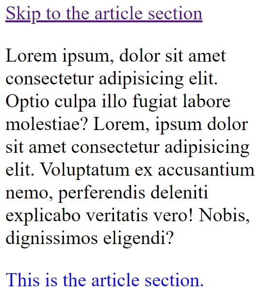
:target
This is used to locate an element that has a URL path.
Now what happens is that an a link, for example, has an id attribute defined in the article element, so when a user clicks on it redirects the user to the id.
To get a better understanding of this, see the examples below.
Example
HTML
 <a href="#content" class="button">Skip to the article section</a>
    <p>
      Lorem ipsum, dolor sit amet consectetur adipisicing elit. Optio culpa illo
      fugiat labore molestiae? Lorem, ipsum dolor sit amet consectetur
      adipisicing elit. Voluptatum ex accusantium nemo, perferendis deleniti
      explicabo veritatis vero! Nobis, dignissimos eligendi?
    </p>
    <article id="content">This is the article section.</article>
CSS
 #content:target,
      article {
        color: blue;
      }
Output
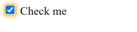
:checked
This is used to style checkbox or radio input elements when they are in a checked state.
Example
HTML
<label>Check me</label>
 <input type="checkbox" />
CSS
  :checked {
        box-shadow: 0px 0px 5px 2px orange;
      }
Output
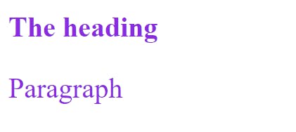
: is
This is used for writing more compact CSS.
Example
Instead of this
.content h2,
.content p {
 color: black;
 font-size: 16px;
}
Write this
.content :is(h2, p) {
  color: black;
  font-size: 16px;
}
Output
:not*
This is used for excluding items or elements that are specified from being styled.
Example
You can exclude all the elements with an id or a class.
CSS
:not([id]) {
  font-size: 16px;
  color: gray;
}
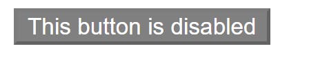
: disabled and : enabled
Disabled pseudo-class makes it impossible for an element to be non-interactive or functional.
Enable pseudo-class does just the opposite of what : disabled class. It's also good to note that all elements are : enabled by default.
Example
HTML
<button disabled>
   This button is disabled
</button>
CSS
button:disabled {
    background: grey;
    color: white;
    cursor: not-allowed;
}
Output
:enabled
This is used to make disabled elements interactive.
PS: You can decide to leave the element blank as all elements are :enabled by default.
Example
HTML
<button enabled>
   This button is enabled
</button>
CSS
button:enabled {
    border: 1px solid green;
}
:first-child and :last-child
The :first-child is used to find and style the first element.
Example
HTML
<div>
   <p>This is the first paragraph</p>
   <p>This is the second paragraph</p>
   <p>This is the last paragraph</p>
</div>
CSS
p:first-child {
   background: yellow;
   color: black;
}
The :last-child is used to find and style the last element.
Example
HTML
<div>
   <p>This is the first paragraph</p>
   <p>This is the second paragraph</p>
   <p>This is the last paragraph</p>
</div>
CSS
p:last-child {
   background: gray;
   color: white;
}
:first-of-type and :last-of-type
This is used to find and style the first and last type of an element.
Example
HTML
<div class="container">
    <p>A paragraph</p>
    <div>First div</div>
    <div>Second div</div>
    <div>Last div</div>
</div>
CSS
.container div:first-of-type {
   color: blue;
}
:last-of-type
This is used to find and style the last type of an element.
By type, I mean elements that are similar.
Example
HTML
<div class="container">
    <p>A paragraph</p>
    <div>First div</div>
    <div>Second div</div>
    <div>Last div</div>
</div>
CSS
.container div:last-of-type {
   color: green;
}
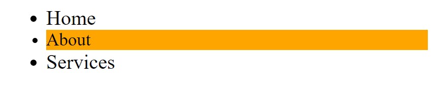
:nth-child and :nth-of-type
This is used to style elements using index(position) values.
Example
HTML
<div>
    <ul>
        <li>Home</li>
        <li>About</li>
        <li>Services</li>
    </ul>
</div>
CSS
ul li:nth-child(2) {
   font-size: 14px;
   background: orange;
}
:nth-of-type This is used to style element types using index(position) values.
Example
HTML
<div class="container">
    <p>A paragraph</p>
    <div>First div</div>
    <div>Second div</div>
    <div>Last div</div>
</div>
CSS
.container div:nth-of-type(2) {
   background: blue;
}
Output
:only-child This is used to style elements that had only one child element.
Example
HTML
<div class="container">
    <ul>
      <li>First list</li>
   </ul>
</div>
CSS
.container ul:only-child {
   color: blue;
}
:empty
This pseudo-class comes in very handy when want to find elements without children and maybe set the display to none.
Example
HTML
<div class="container">
    <ul>
      <li>First list</li>
      <li></li>
   </ul>
     <h3><h3>
</div>
CSS
.container: empty {
   display: none;
}
: invalid and :valid
This can be used to signify a form element that the user input entered is incorrect or correct.
A typical use-case is when someone enters an incorrect email address while filling a form.
Example
HTML
<form>
   <label for="email">Email</label>
    <input type="email" id="email" placeholder="Enter email" required>
</form>
CSS
input:invalid {
   border: 1px solid red;
}
input:valid {
   border: 1px solid green;
}
Output
I hope you found this article pretty useful for your next project in CSS.
Please feel free to drop any question(s) in the comment section. Also if you have any topic or anything you would want me to write about, feel free to drop the name of the topic in the comment section.
Thanks for reading...
See you again!