
How to use flexbox in CSS
You will learn all that is needed about flexbox


Table of contents
I discovered that most people don't really utilize the full potential of flexbox in building responsive layouts. In this article, you will learn everything you need to know to build any application of your choice.
Grab a coffee and let's learn together.
Prerequisite
- I'm assuming that you are already familiar with HTML.
- Not to worry though, this article is very much beginner-friendly and also great for advanced CSS developers.
Flexbox
What is a Flexbox?
Flexbox (Flexible Box Layout Model) is a layout model used for building dimensional layouts. With flexbox, it becomes really easy to organize and place all the items on your website to look exactly how you want to be.
Importance of Flex-Layout
Below are some of the reasons why flex layout has proven to be very relevant in modern web applications.
What can you do with a flex layout? # Flex layouts have the following features, which you will be able to explore in this guide.
They can display as a row or a column.
They are single lines by default but can be asked to wrap onto multiple lines.
Items in the layout can be visually reordered, away from their order in the DOM.
Space can be distributed inside the items, so they become bigger and smaller according to the space available in their parent.
Space can be distributed around the items and flex lines in a wrapped layout, using the Box Alignment properties.
Understanding the concept of Main Axis and Cross Axis
With flex-direction you can detect the main axis of your items. If you set the direction to be along the row then the main axis is along the row. Likewise, if the flex-direction is column, the main axis is along the column.
Flex items moved as a group along the main axis. The Cross axis runs in the opposite direction of the main axis. This means that if flex-direction is along the column then the cross axis is on the row.
Working with Flex-Layout
Before you can work with flex layout, you need to set the display property to flex.
Once you set the display to flex, the flex-direction automatically defaults to row.
Example
HTML
<div class="container">
  <div>Box 1 </div>
  <div>Box 2 </div>
  <div>Box 3 </div>
</div>
CSS
.container {
   display: flex;
}
Controlling the directions of flex items
As I stated above, flex-direction defaults to row even when it wasn't defined.
Some other properties that determine the direction flow of flex items include
column: The items are displayed as columns (vertically).
column-reverse: The items are reordered from the last item in the flex container.
row: The items are displayed as a row(horizontally).
row-reverse: The items are reordered from the last item in the flex container.
Wrapping Items
Normally, when you have too many items in a flex container, they seem to be able to fit either horizontally or vertically because of the viewport (screen size) of the device. The items, tend to overflow from the other set of items.
That's because of flex-wrap which is set to nowrap by default.
In a situation whereby you want the flex items to automatically arrange or realign in the next line instead of overflowing, you set the flex-wrap property to wrap. The aim of doing this is so that you better a user-friendly application for the items.
Example
HTML
<div class="container">
  <div>Box 1 </div>
  <div>Box 2 </div>
  <div>Box 3 </div>
</div>
CSS
.container {
   display: flex;
   flex-wrap: wrap;
}
Flex Shorthand
You can use the flex-flow property to define both the flex-direction and flex-wrap property in CSS.
Example
CSS
.container {
  display: flex;
  flex-flow: row wrap;
}
Another interesting thing to note is the flex item sizes can be increased or reduced using the following properties.
- flex-grow
- flex-shrink
- flex-basis
The default value of flex-grow is 0: The items do not increase. You can decide to increase it, using numbers.
flex-shrink is 1: you can decide to shrink items smaller than their flex-basis using any numerical values.
flex-basis is auto: Items will have a size set to auto. This implies that the size of the item will be determined by the content inside it.
When you don't specify any of these properties, the default flex value will be initial.
You can use the flex property as a shorthand to write the above three properties. Where the first one represents flex-grow, flex-shrink, and flex-auto respectively. You can equally use just a single value. Eg. flex: 1, represents just flex-grow.
Example
.box {
  flex: 2 1 auto;
}
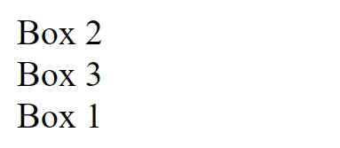
Reorder flex items
You can change the position of flex items using the order property.
Example
HTML
<div class="container">
  <div class="box">Box 1 </div>
  <div class="box">Box 2 </div>
  <div class="box">Box 3 </div>
</div>
CSS
    .container {
        display: flex;
        flex-direction: column;
        gap: 1.5;
      }

      .box:nth-child(1) {
        order: 3;
      }

      .box:nth-child(2) {
        order: 1;
      }

      .box:nth-child(3) {
        order: 2;
      }
Output
Setting Flex Items either Vertically or Horizontally You can use flex properties to distribute space and set items along the main axis and cross axis.
The following are used to distribute space in both the main axis and cross axis.
Justify-content
This is used to distribute space along the main axis. The values used alongside it are flex-start, flex-end, center, space-between,space-around`.
flex-start :
This is used to align the items from the start of the container.
flex-end :
This is used to align the items at the end of the container.
center :
This is used to center the items in the container.
space-between :
This is used to distribute the items using the space of the container.
space-around :
This is used to space the items evenly with spaces around each side of the items.
Please pause for a moment and get your hands dirty with the flex properties before you continue.
Aligning items on the cross axis
When you want to distribute items along the cross axis, you make use of align-content. The default value for align-content is stretch.
You can use the place-content property as a shorthand for justify-content and align-content
Example
CSS
.container {
  display: flex;
   place-content: space- between center;
}
Centering an item along the flex line
When you want to center an item along the flex line, you make use of align-items or align-self. The default value for align-self is stretch.
Other values you can use includes center, flex-start, flex-end , baseline and stretch.
Difference between align-items and align-self
align-self: is used on individual items in the flex container.
align-items: is used on the flex container to set all the individual align-self properties as a group.
I hope you found this article pretty useful for your next project in CSS.
Please feel free to drop any question(s) in the comment section. Also if you have any topic or anything you would want me to write about, feel free to drop the name of the topic in the comment section.
Thanks for reading...
See you again!